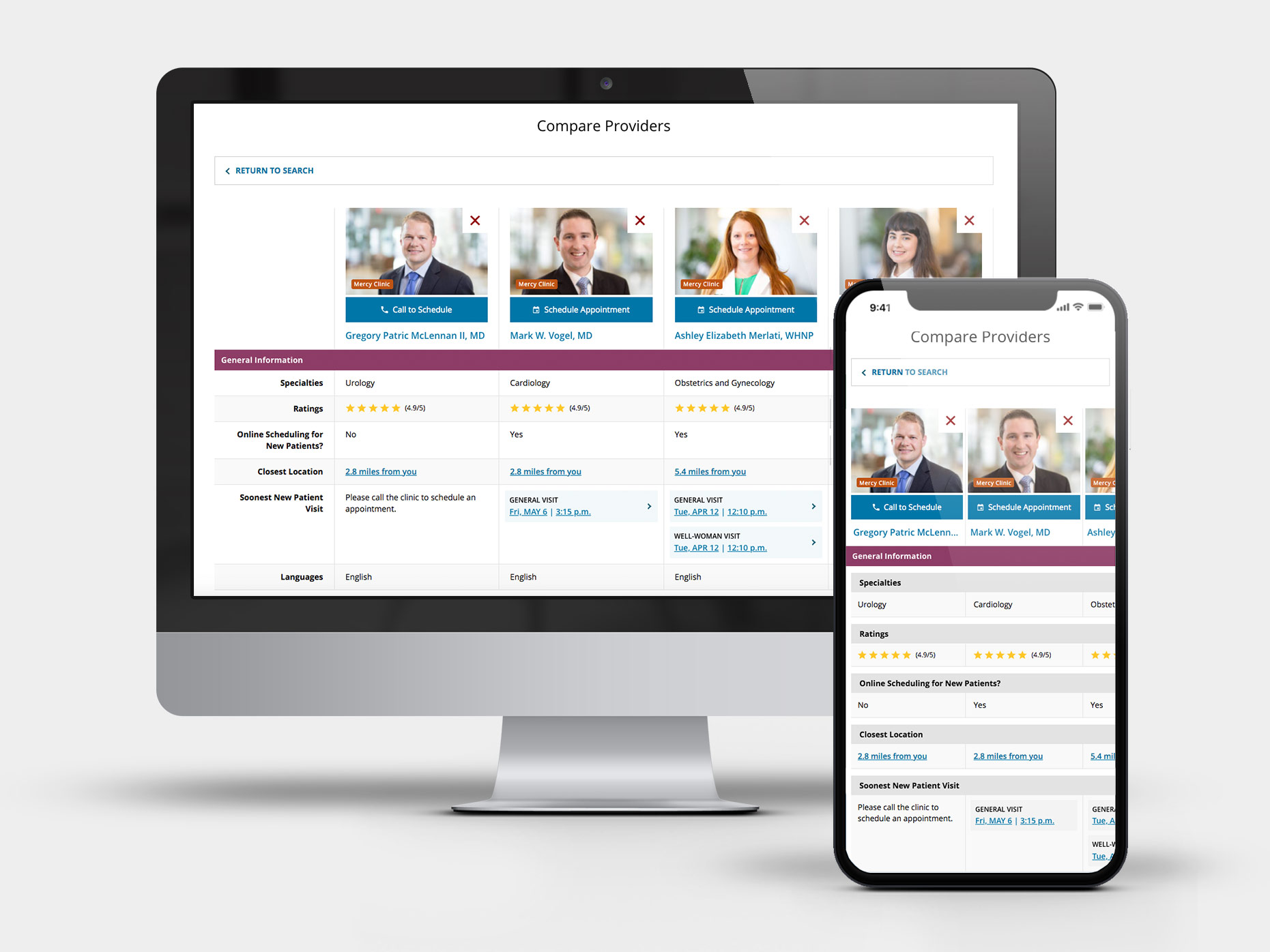
Mercy:
Provider Comparison Tool
Roles: UX Design, Strategy, Architecture
Date: 2020
We identified an area of friction for our patients who are searching for a new provider - being able to quickly compare their credentials and availability at a glance.
- Provide a quick, at-a-glance comparison option for patients utilizing our provider search
- Optimized for mobile viewing
- Bring standard eCommerce functionality to the healthcare space
Initial Research & Baseline Testing:
For the comparison tool, we did several patient surveys in addition to baseline usertesting of our search to gauge interest in having a tool available for this purpose. We also identified key areas of importance to the decision-making process of choosing a provider, and reviewed the general comprehension around the terminology used for each data point. This tool was also part of a larger 'UX Overhaul' for provider-related pages, where we developed new personas, decision trees, and overall architecture.
Overall Findings:
- Patients had some confusion around the different levels of education a provider may have; leading to distrust when misunderstood
- Most patients were the most interested in the providers ratings and review, followed by location and next available appointments
- We had a 50/50 split in whether patients would most likely use a mobile or desktop device while searching for a provider

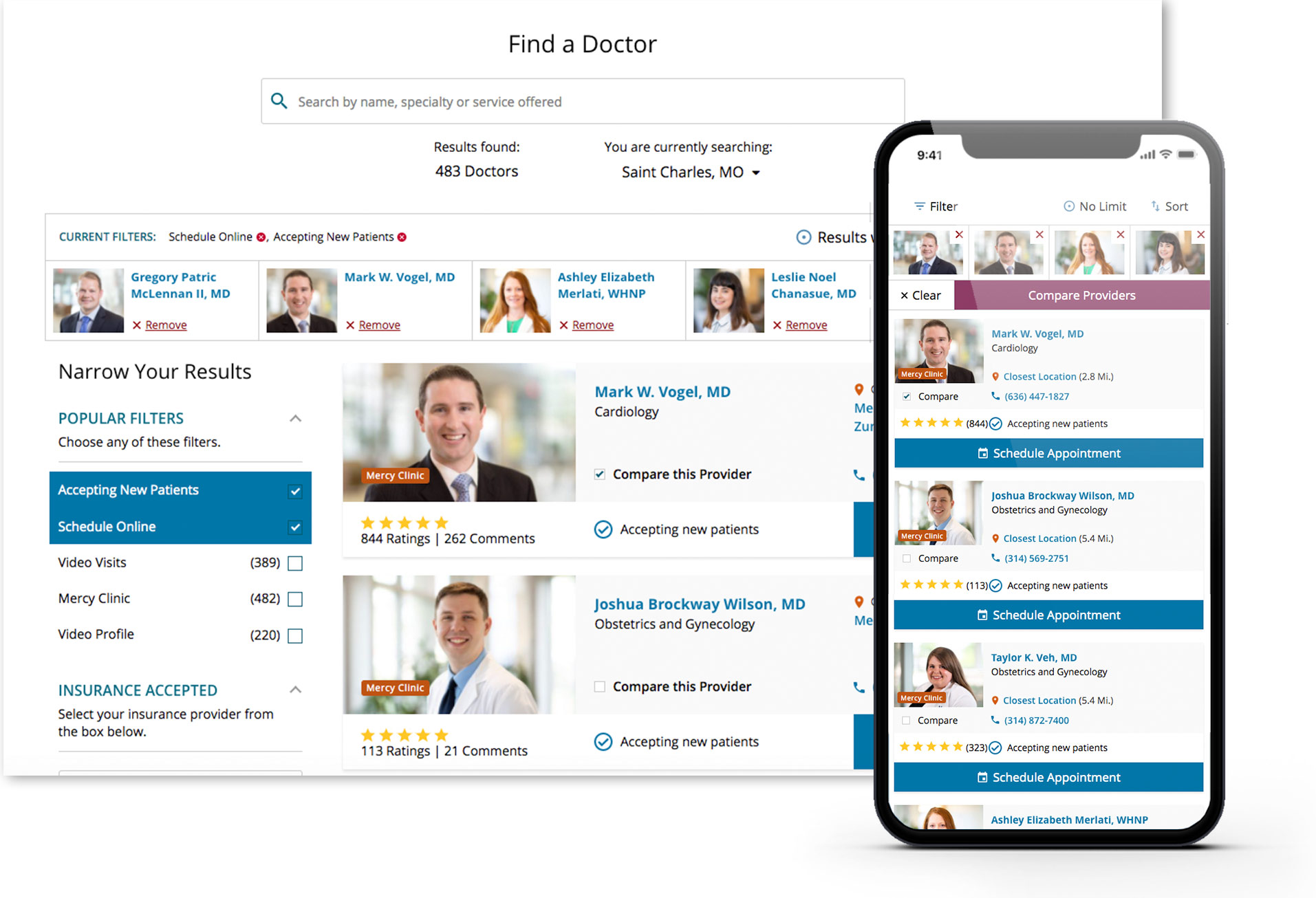
01. Search Integration
Goals:
- Seamlessly integrate the comparison feature without negative impact to usability
- Optimize experiences across mobile and desktop devices
- Persist user selections if they choose to leave search to further their research

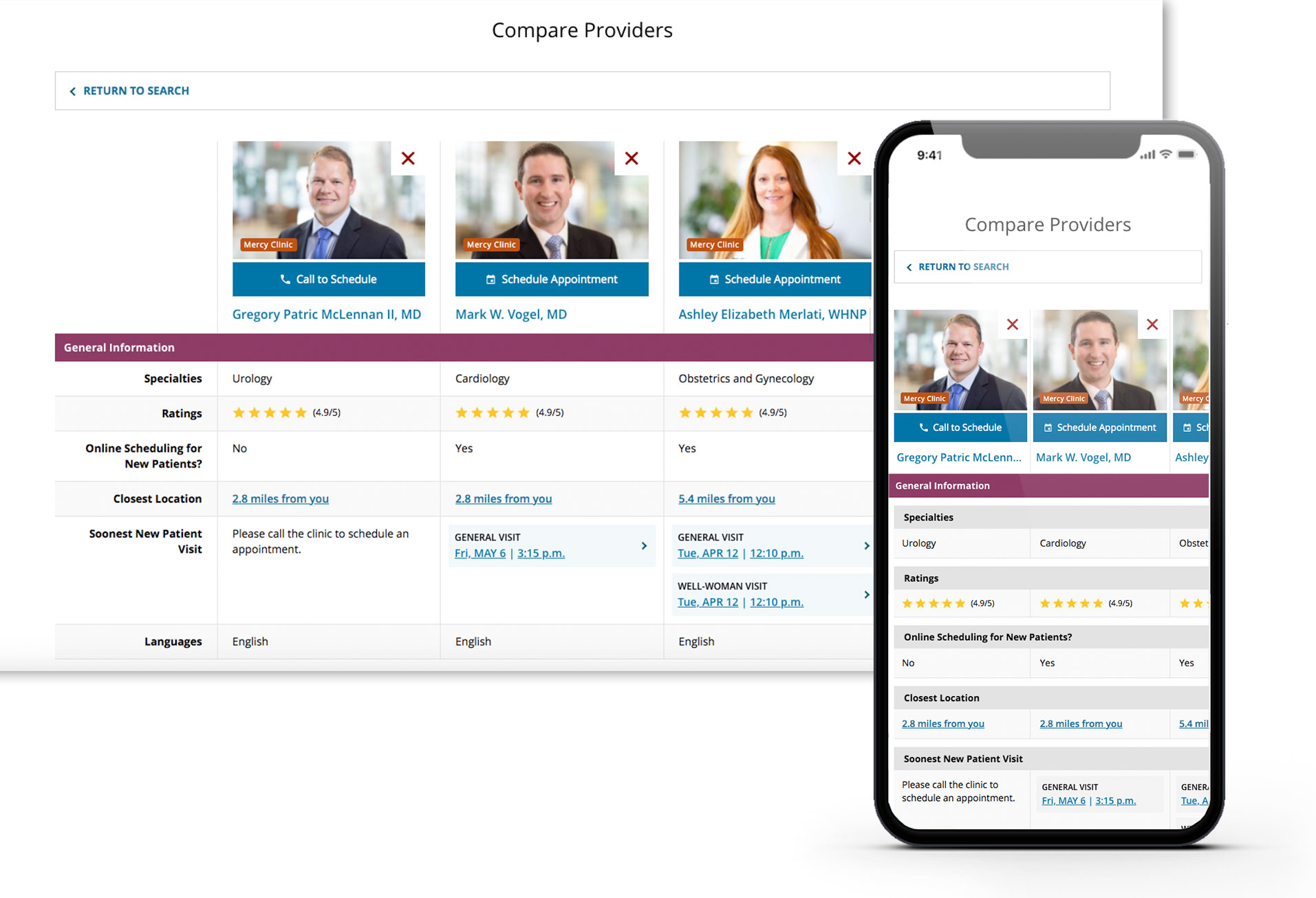
02. Comparison Screen
Goals:
- Group priority information in an intuitive and scannable fashion
- Also providing additional voluntary explanatory information
- Persist selections and allow patients to add / remove from their choice selection
- Connect to our Epic API's to show first available appointment slots, and provide a direct scheduling entry point
